


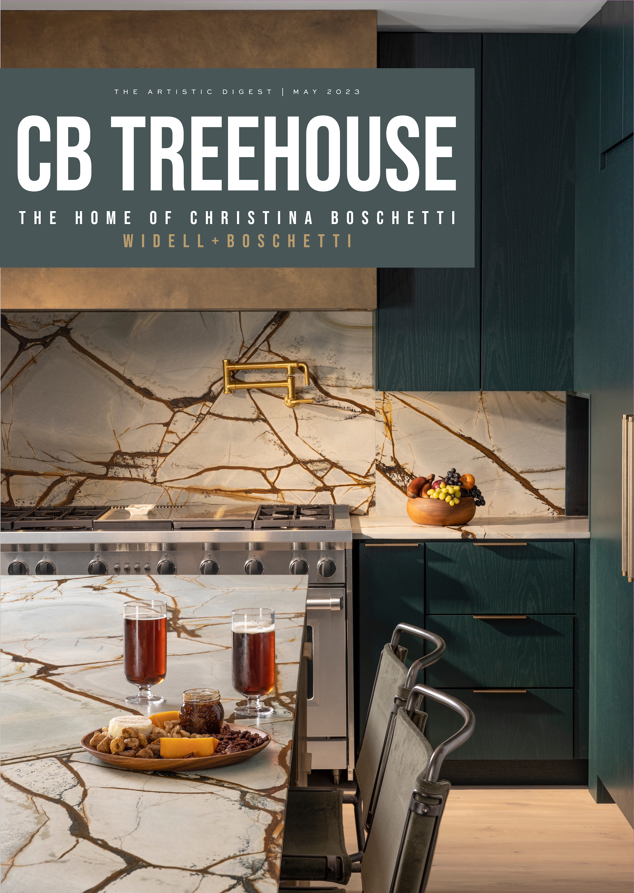


Every Interior Designer relishes the moment when a client’s instantaneous reaction to a new, enticing material elicits an immediate “yes!” When designer Christina Boschetti began working on her own new home, she experienced several of those very happy moments – through the eyes of the homeowner. That happiness punctuated the atmosphere of a year that was very daunting for many – 2020, while the world was in the early stages of the global pandemic. For many people, including Christina, a principal of the ascendant design firm Widell+Boschetti, the time brought much uncertainty. Though she and her

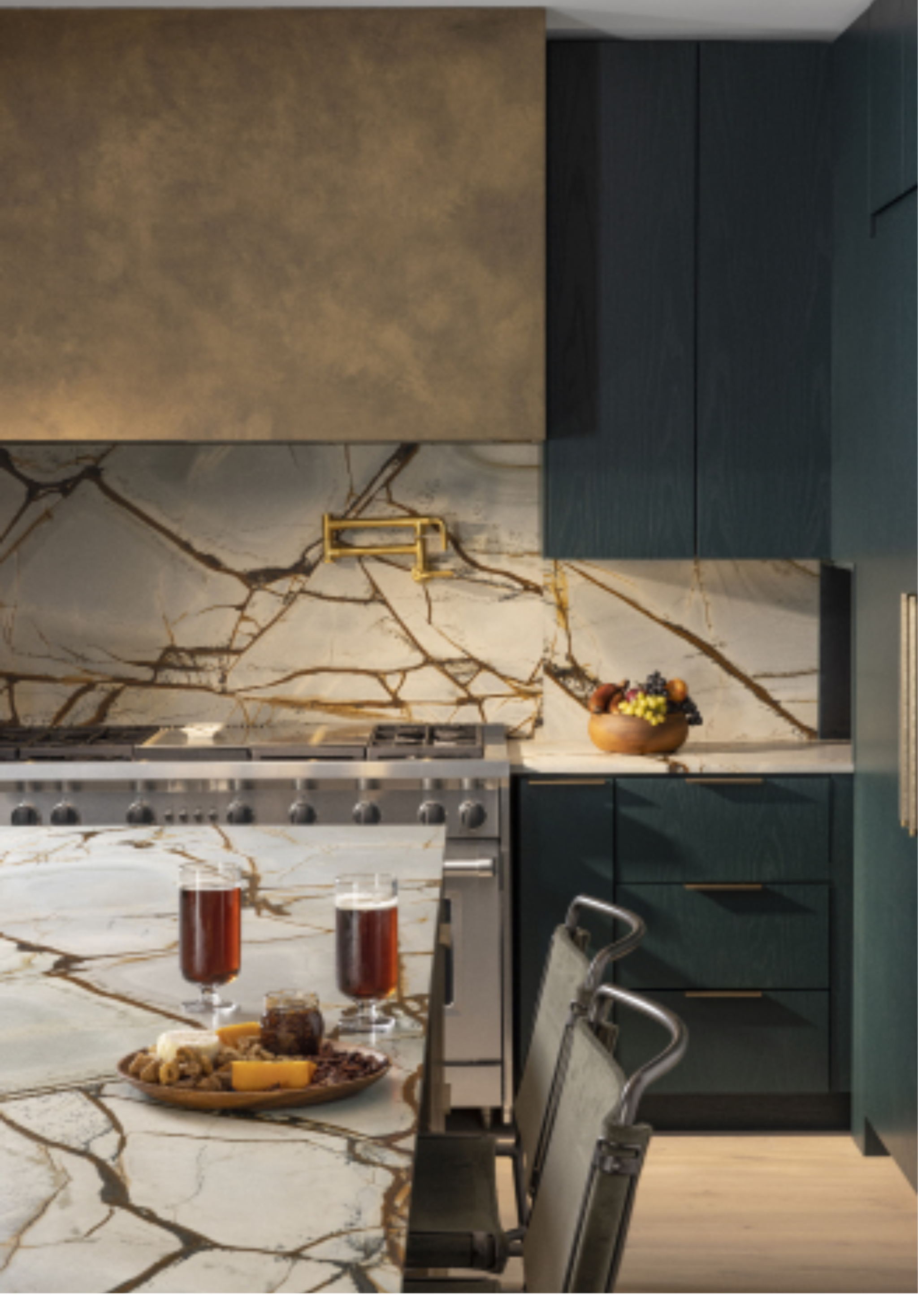
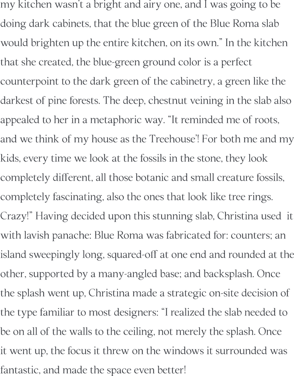
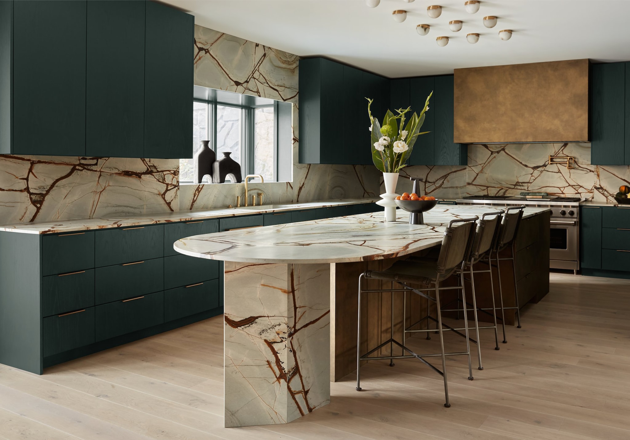
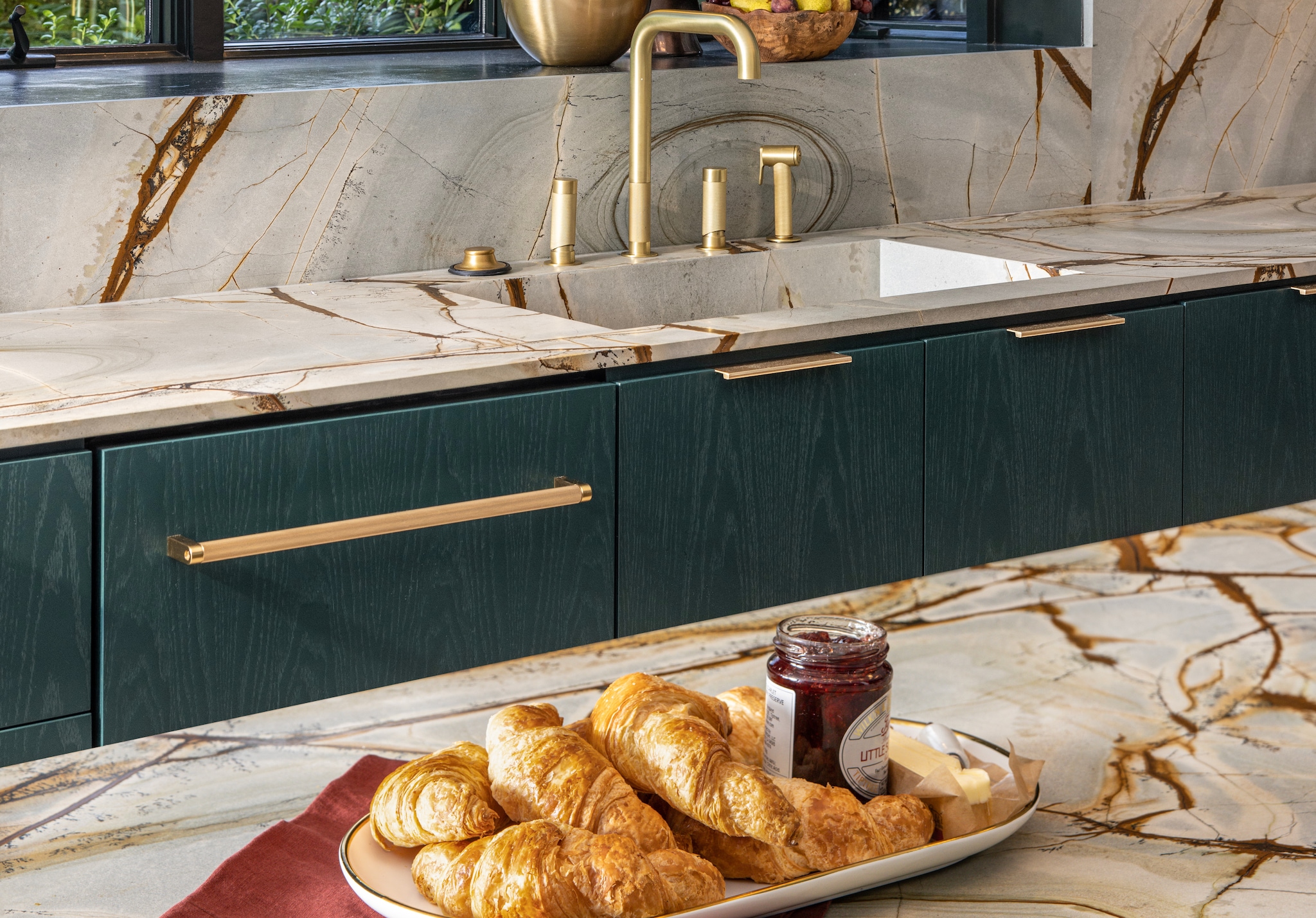
Philadelphia is surrounded by suburbs that have defined the concept of “country life near the city” for over a century, and Christina and her family considered several, but the pull of Moorestown, NJ was uniquely strong: Christina’s business partner Barette Widell had already decamped Philly for the bucolic town across the Delaware from Center City. Filled with leafy gardens and appealing farms, including Barette’s own, Casa Alpaca, it stood out from other possibilities. “We found a house only a three-minute walk from Barette and her family. Some might think that a business partner that close is too much of a good thing, but we are very respectful of each other’s down time, and though our kids have become buddies, even they call before walking over for a visit. It worked out perfectly.” The house itself needed work and had been on the market for several years because of that, but Christina saw the diamond glittering beneath the surface, and took it on. As she began the process, she knew that the kitchen was going to be the heart of her home. Christina’s own style is frequently filled with rich, dark colors, and she had a preliminary vision that included either black or dark green cabinetry. “When I came to [Artistic Tile’s] Slab Gallery and saw the Blue Roma quartzite, I truly felt that because my kitchen wasn’t a bright and airy one, and I was going to be doing dark cabinets, that the
blue green of the Blue Roma slab would brighten up the entire kitchen on its own.” In the kitchen that she created, the blue-green background color is a perfect counterpoint to the dark green of the cabinetry, a green like the darkest of pine forests. The deep, chestnut veining in the slab also appealed to her in a metaphoric way. “It reminded me of roots, and we think of my house as ‘the Treehouse!’ For both me and my kids, every time we look at the fossils in the stone, they look completely different, all those botanic and small creature fossils, completely fascinating, also the ones that look like tree rings. Crazy!” Having decided upon this stunning slab, Christina used it with lavish panache: Blue Roma was fabricated for countertops - a sweepingly long island, squared-off at one end and rounded at the other, supported by a many-angled base - and for the backsplash. Once the splash went up, Christina made a strategic on-site decision of the type familiar to most designers: “I realized the slab needed to be on all of the walls to the ceiling, not merely the splash. Once it went up, the focus it threw on the windows it surrounded was fantastic, and made the space even better!”
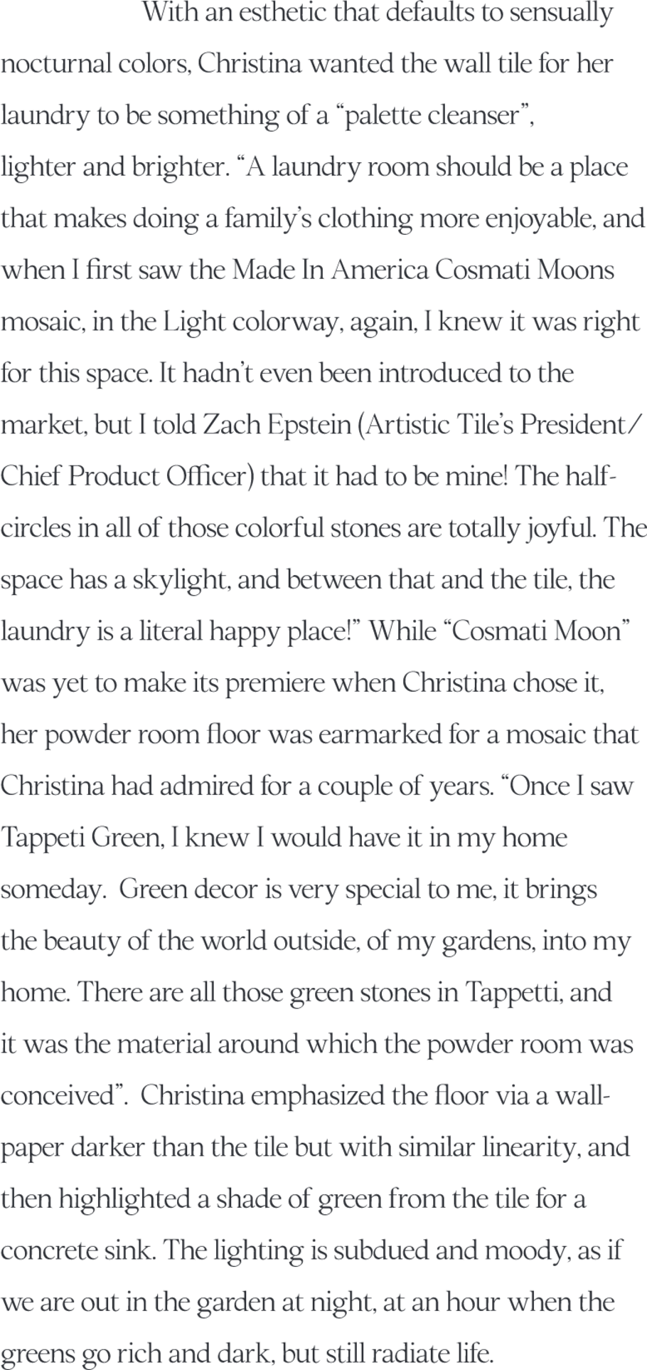
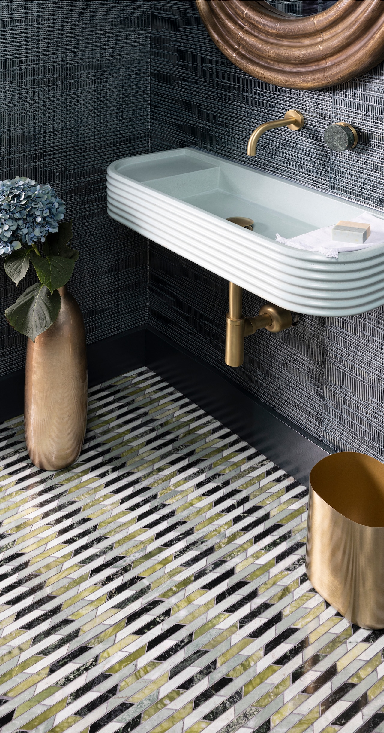
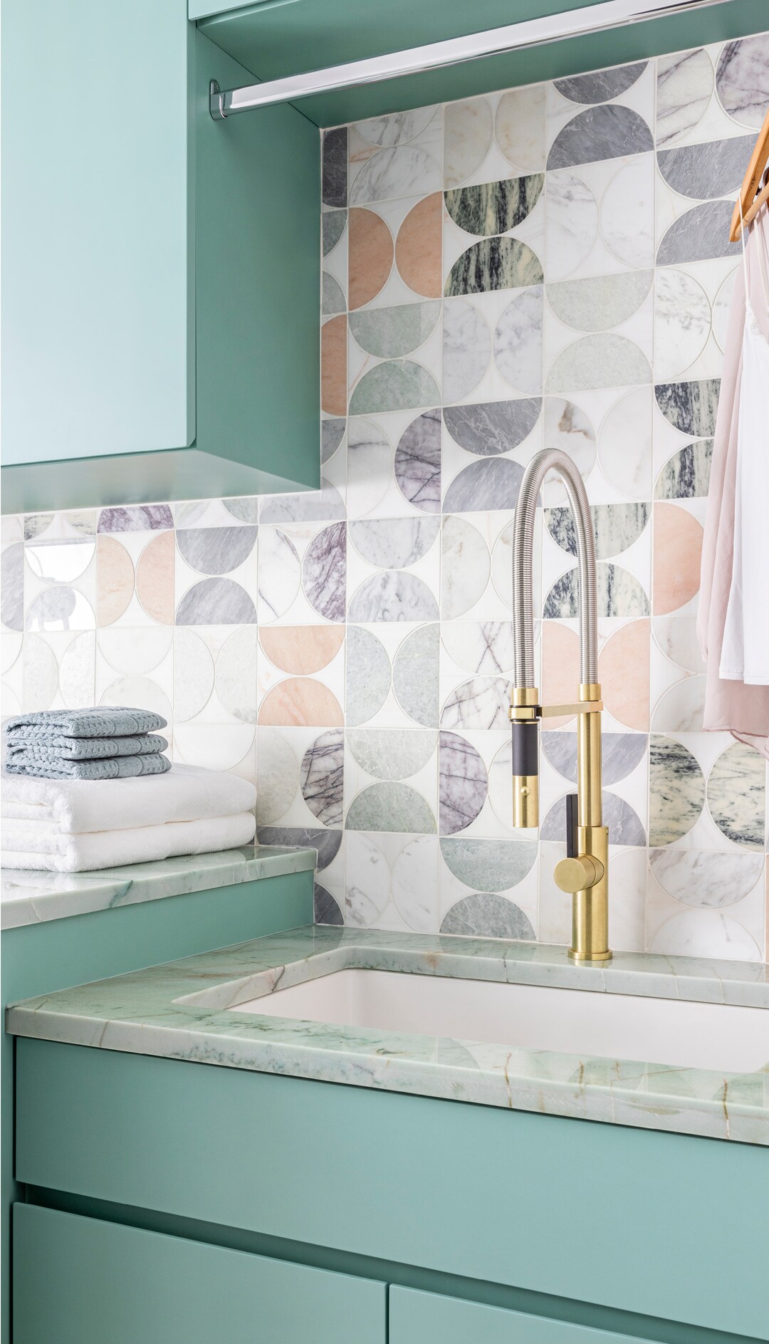
With an aesthetic that defaults to sensually nocturnal colors, Christina wanted the wall tile for her laundry to be something of a “palette cleanser,” lighter and brighter. “A laundry room should be a place that makes doing a family’s clothing more enjoyable, and when I first saw the Made In America’ Cosmati Moons mosaic, in the light colorway, I knew it was right for this space. It hadn’t even been introduced to the market, but I told Zach Epstein (Artistic Tile’s President & Chief Product Officer) that it had to be mine! The half-circles in all of those colorful stones are totally joyful. The space has a skylight, and between that and the tile, the laundry is a literal happy place!” While “Cosmati Moon” was yet to make its premiere when Christina chose it, her powder room floor was earmarked for a mosaic that Christina had admired for a couple of years. “Once I saw Tappeti Green, I knew I would have it in my home someday. Green décor is very special to me, it brings the beauty of the world outside, of my gardens, into my home. There are all those green stones in Tappetti, and it was the material around which the powder room was conceived.” Christina emphasized the floor with a wallpaper that is darker than the tile but with similar linearity, and then highlighted a shade of green from the tile for a concrete sink. The lighting is subdued and moody, as if we are out in the garden at night, at an hour when the greens go rich and dark, but still radiate life.
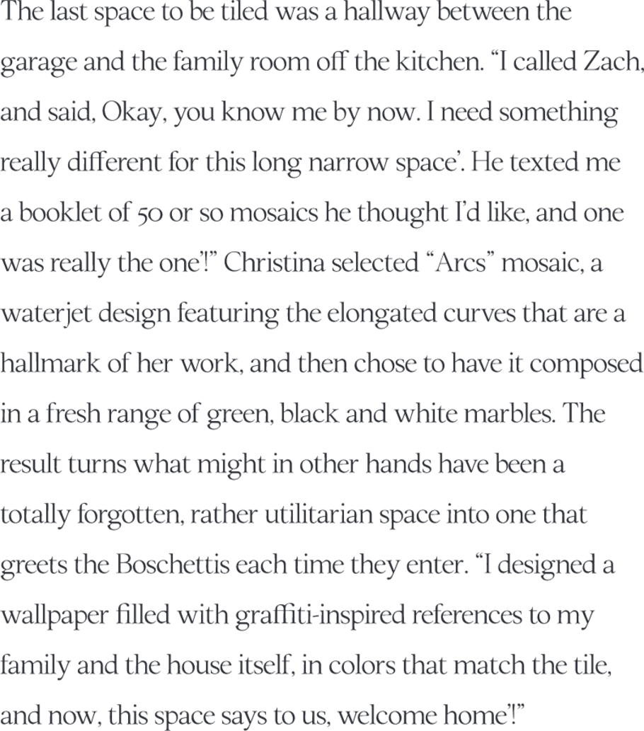
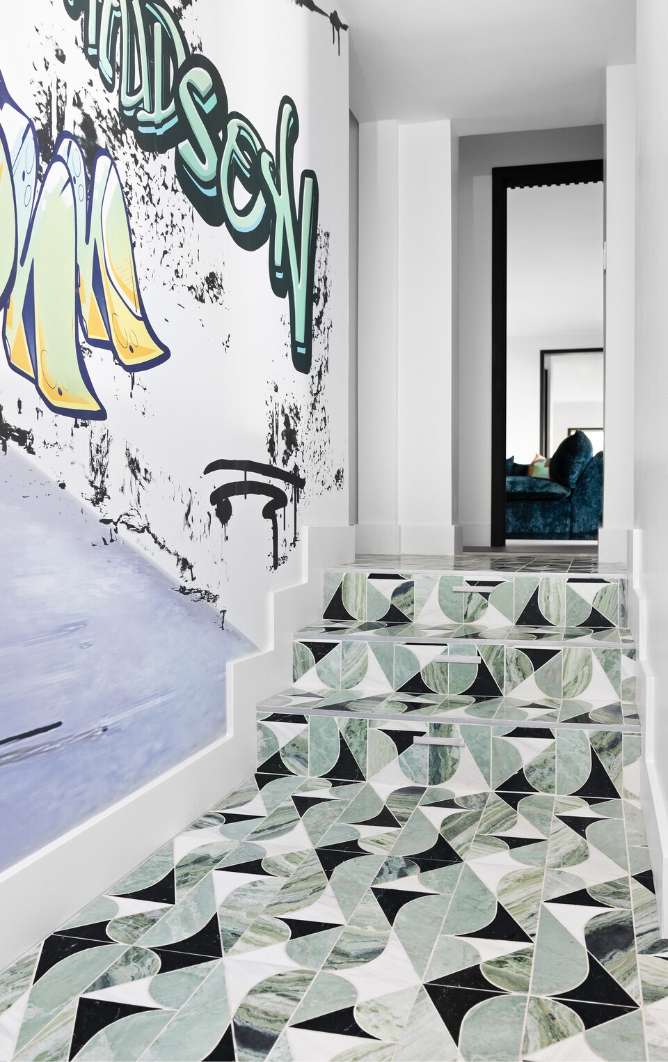
The last space to be tiled was a hallway between the garage and the family room off the kitchen. “I called Zach, and said, Okay, you know me by now. I need something really different for this long narrow space.’ He texted me a booklet of 50 or so mosaics he thought I’d like, and one was really the one!’” Christina selected “Arcs”, a waterjet mosaic featuring the elongated curves that are a hallmark of her work, and then chose to have it composed in a fresh range of green, black, and white marbles. The result turns what might in other hands have been a forgotten, utilitarian space into one that greets the Boschettis each time they enter. “I designed a wallpaper filled with graffiti-inspired references to my family and the house itself, in colors that match the tile, and now, this space says to us, welcome home!’”


husband had just finished building a house in Fishtown, Philadelphia’s most up-and-coming neighborhood, like many, Christina’s response to the challenges of that year was to
re-think how, and where, she wished to raise her children. “Despite the four years we had invested in that very custom project, I knew I wanted something different. And the something different was a house in the country.”